- The Power of Color in Web Design
- 1. Understand Color Associations and Cultural Context
- 2. Understand the Psychological Effects of Different Colors
- 3. Create Effective Color Schemes for Your Website
- 4. Know The Role of Color in Branding and Marketing
- 5. Consider Accessibility When Choosing Color for Web Design
- 6. Know the Current Trends in Color Usage for Websites
- FAQs (Frequently Asked Questions)
The Power of Color in Web Design
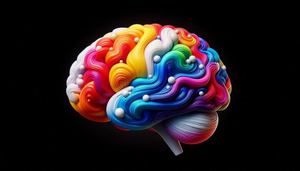
Color psychology is a fascinating field that delves into how colors influence human emotions, behaviors, and perceptions. In web design, leveraging color psychology can transform a mundane interface into an engaging user experience.
The Role of Color Psychology in Web Design
Colors aren’t just decorative elements; they are powerful tools that shape how users interact with a website. By understanding the psychological impacts of different hues, designers can create visually appealing sites that drive user engagement and conversion.
- Red stimulates urgency and passion, often used for calls to action.
- Blue communicates trust and tranquility, perfect for financial institutions.
- Green symbolizes growth and health, ideal for eco-friendly brands.
Key Takeaway:
Colors have a profound impact on user perception and behavior. Choosing the right colors for your website isn’t merely an aesthetic choice—it’s a strategic decision that can influence user actions and brand perception.
Incorporating color psychology in web design ensures that your site looks good and resonates emotionally with your audience, prompting them to engage more deeply with your content. This is where professional services like those offered by AVI Lead Generation, a digital marketing agency designed to help businesses reach more people in their markets with diverse means, can be invaluable. We understand the nuances of lead generation and customer identification, providing tailored solutions that elevate your business strategy.

1. Understand Color Associations and Cultural Context
Color meanings are not universal; they shift dramatically across cultures. For instance, red in Western societies often symbolizes love and passion, yet in China, it signifies good fortune and joy. In contrast, white represents purity and weddings in many Western cultures, while it is associated with mourning in parts of Asia. This illustrates the importance of understanding color symbolism and meanings around the world.
Common Cultural Meanings Associated with Colors
| US | China | India | Africa | |
| Red | Passion/Love | Luck/Prosperity | Marriage/Fertility | Life/Vitality |
| Orange | Autumn/Energy | Vitality/Spirituality | Spirituality | Warmth/Abundance |
| Blue | Calmness/Trust | Spirituality/Nature | Divinity/Protection | Spirituality/Calmness |
How Cultural Context Can Alter Perceptions of Color
The cultural context of color plays a pivotal role in web design. A color that evokes positive emotions in one culture can trigger negative associations in another. For instance, a website targeting a global audience must balance these differences carefully to avoid alienating any segment of its users. This highlights the need for designing for the diversity of cultures’ perception of colors.
Importance of Considering Audience Demographics
When choosing colors for your website, understanding the demographics of your audience is essential:
- Geographical Location: Tailor your palette to reflect regional color preferences.
- Age Group: Younger audiences may respond better to brighter, more vibrant colors.
- Industry Sector: Professional sectors like finance often rely on colors that convey trust and reliability (e.g., blue).
By considering these factors, you create a design that resonates on a deeper emotional level with your target audience.
Moreover, it’s crucial to understand how client applications can benefit from a well-thought-out color scheme that aligns with the cultural perceptions of the target demographic. This understanding can also be instrumental when designing an original logo symbol, as colors play a significant role in brand identity.
Incorporating niche-relevant backlinks strategies into your digital marketing strategy can further enhance your website’s visibility and traffic. This is especially important when considering the emotional resonance of colors with different audience segments as explained in various studies on color psychology and understanding color perception.
2. Understand the Psychological Effects of Different Colors
Understanding the psychological effects of color can change how users interact with your website. Each color can create specific feelings and influence actions, shaping the user experience in significant ways.
The Power of Color in User Experience
Here’s how different colors can impact user emotions and behaviors:
- Red: Known for its intense energy, red stimulates excitement and urgency. It’s a popular choice for calls to action due to its ability to grab attention swiftly. For example, Coca-Cola uses red to evoke passion and enthusiasm, aligning with its brand identity.
- Blue: Associated with trust and calmness, blue is frequently used by financial institutions like PayPal to instill confidence in their services. This hue promotes a feeling of security and reliability.
- Green: Evoking feelings of tranquility and growth, green is ideal for brands focused on health and nature. Websites like Whole Foods Market use green to emphasize their commitment to organic products and sustainability.
- Yellow: Signifying optimism and cheerfulness, yellow can energize users but should be used sparingly. McDonald’s effectively employs yellow in combination with red to create a sense of happiness and urgency that encourages quick decisions.
- Purple: Often linked with luxury and creativity, purple can add an element of sophistication. Brands like Cadbury utilize purple to convey a premium feel, setting themselves apart in the confectionery market.
Enhancing User Interaction Beyond Color Psychology
While color choices are important, there are other factors that contribute to enhancing user interaction on your website:
- Implement effective lead generation tactics designed to capture leads and drive sales.
- Establish clear terms and conditions on your site to build trust with users.
- Use visual elements like logos strategically to enhance brand perception.
Exploring these examples shows how thoughtful decisions in various aspects can guide user emotions and actions, ultimately leading to higher engagement and conversions on your site.

3. Create Effective Color Schemes for Your Website
Understanding Different Types of Color Schemes
Understanding different types of color schemes is crucial in using color psychology effectively in web design. Here are three main schemes:
1. Monochromatic
This scheme involves using various shades and tints of a single color. It creates a harmonious and cohesive look, making it ideal for minimalist designs. For example, Dropbox uses a monochromatic blue scheme to convey trust and simplicity.
2. Complementary
Complementary colors are those opposite each other on the color wheel, such as blue and orange. This scheme offers high contrast and visual interest, making elements stand out. HubSpot’s website effectively employs complementary colors to highlight key areas.
3. Analogous
Analogous colors are adjacent to each other on the color wheel, like green, yellow-green, and yellow. This scheme evokes harmony and comfort, often seen in nature-themed websites. National Geographic’s site is a prime example, using analogous earth tones to create an inviting atmosphere.
Tips for Selecting an Appropriate Color Palette
Choosing the right color palette is essential for aligning with your brand identity and target audience:
- Understand Your Brand: Reflect your brand’s personality through colors. A tech company might opt for blues to signify innovation and reliability, while a fashion brand might use bold reds or blacks to exude sophistication.
- Consider Your Audience: Align your palette with your audience’s preferences and cultural context. For instance, using red in Asian markets can symbolize prosperity and good fortune.
- Test Different Combinations: Use tools like Adobe Color or Coolors to experiment with different schemes before finalizing your choice.
- Maintain Consistency: Ensure that your chosen palette is consistent across all digital touchpoints—from your website to social media—reinforcing brand recognition.
- Pay Attention to Accessibility: Ensure sufficient contrast between text and background colors for readability, enhancing user experience for all visitors.
- Utilize Real-Time Chat Widgets: Implementing a chat widget on your website can significantly boost engagement and conversions by providing real-time assistance to visitors.
By thoughtfully selecting and applying color schemes in web design, you create an engaging visual experience that resonates with users while reinforcing your brand’s identity. Additionally, consider incorporating features like a transparent logo or utilizing AI chat widgets to further enhance user experience on your site.

4. Know The Role of Color in Branding and Marketing
Colors are powerful tools that shape how a brand is perceived and how consumers feel about it. When used strategically, colors can greatly improve how well a brand is remembered and recognized.
How Colors Influence Brand Messaging
Here are some examples of how different brands use colors to communicate their messages:
- Red: Coca-Cola’s iconic red not only grabs attention but also evokes feelings of excitement and passion, aligning perfectly with its brand messaging.
- Blue: Tech giants like Facebook and IBM utilize blue to communicate trust, reliability, and professionalism, fostering user confidence. This is a classic example of digital marketing strategies where color plays a crucial role.
- Yellow: McDonald’s golden arches are synonymous with joy and friendliness, creating a welcoming atmosphere for families.
Case Studies
Let’s take a look at some real-life examples of how brands have successfully used colors in their branding:
- Apple: Apple’s minimalist design approach is complemented by its use of neutral colors like white, black, and silver. This choice emphasizes simplicity, sophistication, and innovation—key aspects of Apple’s brand identity.
- Starbucks: The rich green in Starbucks’ logo represents growth, freshness, and environmental consciousness. This color choice supports its brand story around sustainability and premium quality coffee.
- Spotify: Spotify’s vibrant green logo stands out in the digital world, conveying energy and growth. It resonates with users seeking dynamic music experiences.
Branding through color choices isn’t just about looking good; it’s a strategic move that can either create strong connections with consumers or drive them away. By understanding the psychological effects of colors, brands can create identities that attract new customers and keep existing ones loyal.
The Bigger Picture: Holistic Branding
It’s important to note that branding goes beyond just colors; it involves creating an overall image that speaks to consumers on various levels. For example, a well-designed logo can serve as a powerful visual representation of a brand’s identity. This highlights the significance for businesses to invest in professional logo design as part of their comprehensive branding strategy.
In today’s competitive landscape, using digital marketing techniques alongside effective branding strategies can greatly improve a business’s visibility and sales.

5. Consider Accessibility When Choosing Color for Web Design
Accessibility in web design is crucial, especially when considering the diverse needs of users. Ensuring sufficient contrast between text and background colors can significantly enhance readability. Low contrast can strain the eyes, making the content difficult to read and drive users away.
Guidelines for Creating Inclusive Designs
- Contrast Ratio: Aim for a contrast ratio of at least 4.5:1 for standard text and 3:1 for larger text. Tools like WebAIM’s Contrast Checker help you verify these ratios.
- Color Blindness: Approximately 8% of men and 0.5% of women have some form of color blindness. Use color combinations that are distinguishable to everyone. Avoid relying solely on color to convey information; incorporate patterns or textures where applicable.
- Readable Fonts: Choose fonts that are legible and pair well with your chosen colors. Sans-serif fonts often provide better readability on digital screens.
- Alternative Indicators: Supplement color cues with text labels, icons, or other visual indicators to assist users with visual impairments.
- Consistent Design: Maintain consistency in your color usage throughout the site to create a cohesive experience that is easy to navigate.
“Design is not just what it looks like and feels like. Design is how it works.” – Steve Jobs
The focus on accessibility ensures all users enjoy a seamless experience, reflecting your brand’s commitment to inclusivity and excellence in web design.
Incorporating elements such as an Amazon social media background can further enhance user engagement while still adhering to these accessibility guidelines. Additionally, partnering with a B2B digital marketing agency can help elevate your business strategy by ensuring your web design meets these important accessibility standards.

6. Know the Current Trends in Color Usage for Websites
In the ever-changing world of web design, being aware of color trends can make your brand stand out. Modern designs lean towards bright and lively colors that grab attention while still being easy to use.
Popular Colors and Combinations
Here are some popular color trends in web design:
- Bold Neons and Gradients: Neon colors combined with gradients create an energetic and modern feel. This trend is prevalent in tech startups and creative agencies.
- Muted Pastels: Soft, pastel shades offer a calming experience, ideal for wellness and lifestyle brands.
- Dark Mode Palettes: With the rise of dark mode, deep blacks paired with bright accents enhance readability and reduce eye strain.
- Earthy Tones: Natural colors like terracotta and sage green evoke a sense of sustainability, popular among eco-conscious brands.
Leveraging Trends: Netflix and Facebook
Netflix masterfully uses rich reds to stimulate excitement and urgency, enhancing viewer engagement. The red accent not only aligns with their branding but also highlights critical elements like “Play” buttons.
Facebook, on the other hand, utilizes various shades of blue to foster trust and connectivity. The consistent blue palette supports its mission of creating a reliable social networking environment.
Understanding these trends and strategically applying them can transform your web design approach, leading to higher engagement and conversion rates. Better yet, take advantage of the team at AVI Lead Gen and let us take the guesswork out of your website design today!
FAQs (Frequently Asked Questions)
What is color psychology and why is it important in web design?
Color psychology refers to the study of how colors affect human emotions and behaviors. In web design, understanding color psychology is crucial because colors can significantly impact user perception and behavior, influencing how visitors interact with your website.
How do cultural contexts influence color associations?
Cultural contexts can alter the meanings associated with colors. For example, while white symbolizes purity in many Western cultures, it may represent mourning in some Eastern cultures. Therefore, it’s important to consider your audience’s demographics and cultural backgrounds when selecting colors for your website.
What are the psychological effects of different colors?
Different colors evoke specific emotions and can influence human behavior. For instance, blue often conveys trust and calmness, while red can evoke excitement or urgency. Many successful websites strategically use these color associations to elicit desired emotional responses from users.
What types of color schemes can be used in web design?
Common types of color schemes include monochromatic (variations of a single color), complementary (colors opposite on the color wheel), and analogous (colors next to each other on the wheel). Each type impacts user experience differently, so it’s essential to choose a scheme that aligns with your brand identity and target audience.
How does color influence branding and marketing?
Color plays a vital role in brand recognition and recall. Successful brands often use specific colors consistently across their marketing materials to establish a strong brand identity. For example, brands like Coca-Cola use red to evoke excitement and energy, reinforcing their brand message.
What accessibility considerations should be considered when using color in web design?
Ensuring sufficient contrast between text and background colors is essential for readability, particularly for users with visual impairments. Following guidelines for inclusive design helps create an accessible experience for all users, allowing everyone to engage with your website effectively.