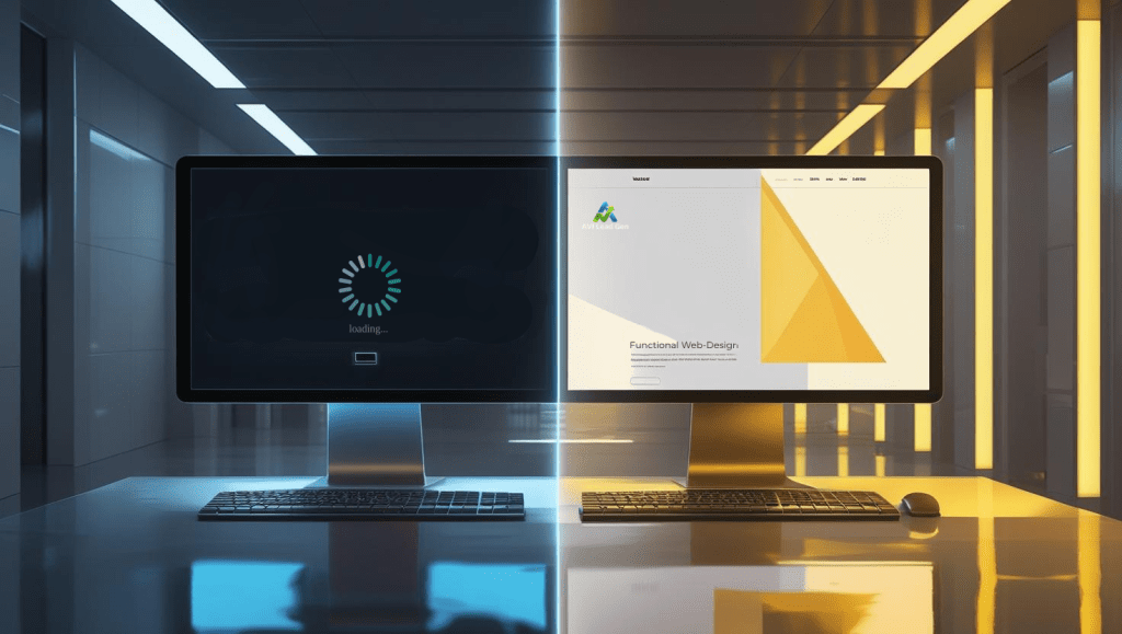
Is Your Website Design Hurting Your Conversions?
This is a crucial question that every business must answer if they want to succeed in the online market. A poorly designed website can act as an invisible barrier, driving potential customers away before they even have a chance to interact with your brand. Things like a messy layout, confusing navigation, or slow loading times can quietly lower your conversion rates without you even knowing it.
A smooth user experience combined with a simple and easy-to-understand layout is essential for keeping leads interested and increasing sales. Customers expect websites to be both visually appealing and easy to use, with quick loading times.
The main point: Making simple yet strategic design improvements can significantly boost converting website visitors. This article offers practical tips on how to improve website conversions through thoughtful, user-centered design that aligns with effective conversion strategies.

The Role of User Experience in Driving Conversions
User Experience as a Catalyst for Conversions
User experience (UX) is the foundation for converting website visitors. When visitors have a smooth and user-friendly experience while browsing your site, they are more likely to interact with your content, products, or services. There are many real-world examples of businesses that have suffered from poor UX, resulting in lost leads and decreased sales opportunities.
Navigational Clarity for Enhanced Engagement
The navigation structure of your website is crucial in determining user satisfaction and conversion rates. Confusing or cluttered navigation can frustrate visitors, leading to higher bounce rates and missed conversion opportunities. It is essential to simplify the navigation process and ensure clear paths to desired information or actions in order to keep users engaged and guide them towards conversion.
For our free guide, 10 Easy-to-Follow Navigation Tips for Web Design, consider subscribing to our weekly newsletter below. We’ll send you updates and noteworthy digital marketing articles directly to your email. cancel anytime.
Furthermore, the importance of web design cannot be overstated. A well-designed website not only enhances user experience but also plays a significant role in converting website visitors. By prioritizing user experience, optimizing navigation for clarity and ease of use, and focusing on effective web design, you create an environment that fosters improved conversions and greater user engagement on your website.
1. Slow Load Speeds: The Silent Conversion Killer
In today’s fast-paced digital world, every second counts. Studies show that a mere one-second delay in page load time can result in a 7% reduction in conversions. That’s right—if your website takes too long to load, potential customers are likely to abandon their shopping carts and look elsewhere.
The Impact of Slow Loading Times
User retention and overall conversions are heavily influenced by loading speeds. According to industry studies:
- 40% of users will abandon a website if it takes more than three seconds to load.
- 79% of online shoppers who experience difficulty with website performance say they won’t return to the site again.
- Google found that as page load time increases from one second to ten seconds, the probability of a mobile site visitor bouncing increases by 123%.
These statistics highlight the critical role that loading speeds play in keeping users engaged and converting website visitors.
Optimizing Image Files for Faster Loading
One common culprit behind slow loading times is large image files. High-resolution images can significantly impact your website’s performance, leading to longer loading times. Here are some practical tips for optimizing image files without sacrificing quality:
- Use next-gen formats like WebP: WebP is an image format developed by Google that provides superior compression compared to traditional formats like JPEG and PNG. By using WebP for your images, you can reduce file sizes without compromising quality.
- Implement lazy loading techniques: Lazy loading is a technique where images are only loaded when they come into the user’s viewport (visible area). This means that images below the fold won’t be loaded until the user scrolls down, resulting in faster initial page loads.
Testing Your Web Page Loading Speed
To ensure that your efforts in optimizing loading speeds are effective, it’s essential to regularly test your web page loading speed. There are several free resources available that allow you to do this:
- Google PageSpeed Insights: This tool analyzes your web page and provides insights on how to improve its performance.
- GTmetrix: GTmetrix offers detailed reports on your website’s loading speed and performance metrics.
- Pingdom: Pingdom allows you to test your web page loading speed from different locations around the world.
By utilizing these resources, you can identify areas for improvement and make necessary optimizations to enhance your website’s loading speeds.
Additionally, consider implementing speed optimization techniques such as caching, minifying CSS and JavaScript files, and reducing server response time for better results.
Remember, every second matters when it comes to retaining users and driving conversions. By optimizing your loading speeds, you can create a seamless browsing experience that keeps customers coming back for more.
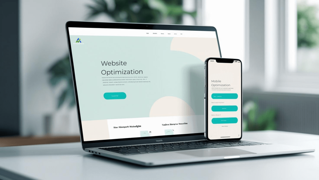
2. Mobile Optimization: A Necessity, Not an Option
Mobile devices dominate internet usage, ensuring your website is optimized for mobile is no longer a choice but a necessity. With data showing the increasing share of online purchases made by mobile users, you must cater to their needs or risk missing out on potential conversions and sales.
If your website isn’t mobile-friendly, you could be turning away a significant portion of your audience. Here are some reasons why your current design might be hurting your conversion rates:
- Poor user experience: If visitors have to pinch and zoom or scroll horizontally to view your content, they’re likely to leave and look for a more user-friendly alternative.
- Slow loading times: Mobile users often have slower internet connections compared to desktop users. If your site takes too long to load on mobile devices, potential customers may abandon it before even seeing what you offer.
- Inconsistent branding: If your mobile site looks drastically different from your desktop version, it can create confusion and mistrust among users. Consistency in branding across all devices is essential for building credibility.
Responsive Design Techniques to Enhance User Experience
To create a seamless browsing experience across various devices, consider implementing these responsive design techniques:
- Fluid grids: Instead of using fixed pixel widths for your layout elements, opt for percentage-based widths that adapt to different screen sizes.
- Flexible images: Use CSS techniques like max-width: 100% to ensure images scale proportionally within their containers.
- Media queries: Apply specific styles based on the device’s screen size using media queries in your CSS.
By incorporating these techniques into your web design process, you can significantly enhance user experience and drive conversions.
Future-Proofing Your Online Presence
Remember, in the competitive digital landscape, every click matters. Prioritizing mobile optimization isn’t just about adapting to current trends—it’s about future-proofing your online presence and staying ahead of the curve.
As technology continues to evolve and new devices enter the market, it’s essential to ensure your website remains accessible and user-friendly across all platforms. By embracing mobile-friendly design practices today, you not only enhance user satisfaction but also increase your chances of driving more online sales and conversions in the future.

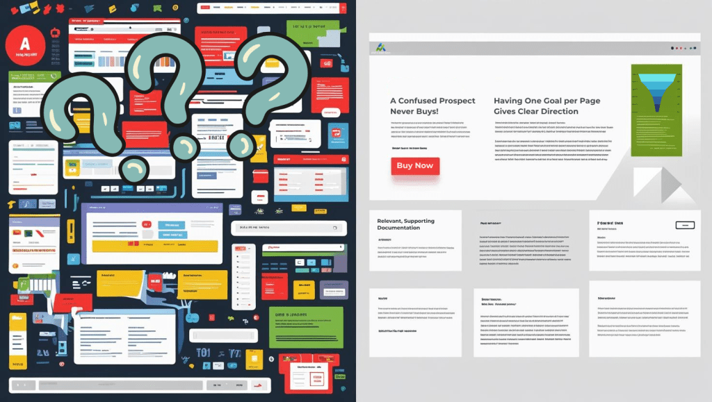
3. The Power of Clear Calls-to-Action and Trust Signals
Conversion rates depend heavily on how clear and persuasive your call-to-action (CTA) buttons. These buttons play a crucial role in convincing a visitor to become a customer. An effective CTA is straightforward, stands out visually, and matches the user’s intention at that moment. When CTAs are unclear or lost among other elements, potential buyers may hesitate, resulting in lost sales.
How Trust Signals Enhance CTAs
Trust signals enhance the effectiveness of CTAs by making the decision-making process easier. Elements like customer reviews, security badges, and guarantees provide psychological comfort. For example:
- Customer Reviews: Show genuine testimonials close to CTAs to confirm product quality and service dependability.
- Security Badges: Place SSL certificates or payment security icons near checkout buttons to increase trust.
- Money-Back Guarantees: Emphasize risk-free offers to motivate users to act without fear.
Examples of Effective CTA Designs
Here are some examples of effective CTA designs:
- Contrasting Colors: Use button colors that stand out from the rest of the site palette but still go well with its overall look to grab attention without creating visual discord.
- Action-Oriented Text: Replace generic phrases like “Submit” with compelling directives such as “Get Your Free Quote” or “Start Your Trial Today.”
- Size and Placement: Position CTAs prominently above the fold or at natural stopping points in content flow to capture engagement when interest peaks.
A well-crafted CTA combined with visible trust signals creates an easy pathway for visitors to convert confidently. Each element supports the other, making interactions smooth and reducing uncertainty that leads to drop-offs. To further optimize conversion rates, consider implementing some CRO fixes which can significantly improve user experience and boost sales.
4. Clean Designs Enhance Readability & Engagement
A cluttered layout overwhelms visitors, diluting key messages and increasing cognitive load. Research consistently shows that minimalistic designs improve user comprehension by directing attention to essential elements without distractions. Users process information faster and feel more comfortable navigating pages that embrace simplicity.
The Role of White Space in Design
White space, often misunderstood as wasted space, functions as a strategic design tool. It creates visual breathing room, separates content logically, and enhances overall readability. Websites employing ample white space achieve higher engagement rates because users can scan content effortlessly, locating calls-to-action and value propositions with ease.
Strategies for Leveraging White Space
Consider these strategies to leverage white space effectively:
- Group related elements: Use padding and margins to cluster associated content while separating distinct sections.
- Limit the number of fonts and colors: A restrained palette reinforces brand identity without causing visual noise.
- Prioritize hierarchy: Employ larger font sizes and bold typography for headlines contrasted by generous spacing around paragraphs.
- Simplify navigation menus: Clear, concise options prevent decision fatigue and keep users focused on conversion goals.
- Use grids and alignment: Consistent structural patterns encourage flow and predictability within page layouts.
Many top-performing websites adopt this philosophy. Apple’s product pages exemplify how sparse use of text combined with high-quality imagery and white space directs visitors toward purchasing decisions. Such designs respect user attention span while conveying professionalism.
The Impact of Clean Design on Trust and Conversion
Clean design fosters trust by signaling clarity and transparency. When visitors encounter easy-to-read content arranged in an uncluttered format, they spend more time exploring offerings rather than searching for information. This behavior directly correlates with increased conversion potential.

5. Optimize Visual Elements for Higher Conversions
High-quality images and compelling product descriptions can significantly impact your website’s conversion rates. In this section, we’ll explore how these visual elements can be optimized for higher conversions across devices.
The Power of High-Quality Images
Images are often the first thing visitors notice when they land on your website. Using high-quality images that showcase your products from different angles can help capture their attention and make a lasting impression. Here are some tips for optimizing your images:
- Use professional photography or invest in a good camera to take high-quality pictures of your products.
- Show your products in use or in real-life situations to give customers a better understanding of how they can benefit from them.
- Optimize image file sizes to ensure fast loading times without compromising quality.
- Implement strategies for Google Image Optimization to improve your visibility on search engines.
Crafting Compelling Product Descriptions
While images are important, they should be complemented by well-written product descriptions that provide additional information and persuade customers to make a purchase. Here are some strategies for writing compelling product descriptions:
- Focus on benefits rather than features: Instead of simply listing the specifications of your product, highlight how it can solve a problem or improve the customer’s life.
- Use storytelling techniques: Incorporate anecdotes or stories into your product descriptions to create an emotional connection with potential buyers.
- Highlight unique selling points: Identify what sets your product apart from competitors and emphasize those qualities in your descriptions.
By optimizing both visual elements and written content on your website, you can create a more engaging experience for visitors and increase the likelihood of conversions across all devices.

Conclusion
Your website design plays a crucial role in driving conversions. Make sure your design is optimized for user experience and conversion rates to maximize your business potential. Don’t let a poor design be the reason behind lost leads and sales opportunities.
Take charge now and make the necessary changes to see significant improvements in your conversion rates. Your website design should work for you, not against you.

FAQs (Frequently Asked Questions)
How does poor website design negatively impact conversion rates?
Poor website design can confuse visitors, create frustrating navigation experiences, and slow down loading times, all of which lead to higher bounce rates and lost sales opportunities. A cluttered or non-intuitive layout fails to retain leads and discourages users from completing desired actions, ultimately killing your conversions.
Why is user experience (UX) crucial for driving website conversions?
A seamless user experience directly influences conversion rates by making it easy and enjoyable for visitors to navigate your site, find information, and take action. Businesses with poor UX often suffer from increased bounce rates and missed sales because users get frustrated or confused. Enhancing UX through clear navigation and intuitive design keeps users engaged and boosts conversions.
What role do loading speeds play in website conversions?
Loading speed is a silent conversion killer; slow-loading pages cause users to abandon your site before engaging with content or making purchases. Optimizing image files using next-gen formats like WebP, implementing lazy loading techniques, and leveraging content delivery networks can significantly improve load times and user retention, thereby increasing conversions.
How important is mobile optimization for increasing online sales?
Mobile optimization is no longer optional but essential due to the growing share of online purchases made via mobile devices. Responsive design techniques such as fluid grids and flexible images ensure your website adapts seamlessly across devices, providing a smooth user experience that drives more online sales and improves overall conversion rates.
How do clear calls-to-action (CTAs) and trust signals influence conversion rates?
Persuasive CTAs guide visitors toward taking desired actions like making a purchase or signing up, while visible trust signals such as customer reviews and security badges build confidence in your brand. Combining effective CTA designs that stand out yet align with your site’s aesthetic can significantly increase conversion rates by encouraging user engagement.
Why are clean designs with ample white space beneficial for website conversions?
Minimalistic designs enhance readability and user comprehension by reducing clutter, allowing visitors to focus on key messages and actions. Strategically incorporating white space improves visual appeal and engagement, leading to better user experiences that translate into higher conversion rates compared to busy or overwhelming layouts.
Share this post: